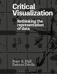
Critical Visualization: Rethinking the Representation of Data
- Добавил: literator
- Дата: 31-12-2022, 06:01
- Комментариев: 0
 Название: Critical Visualization: Rethinking the Representation of Data
Автор: Peter A. Hall, Patricio Davila
Издательство: Bloomsbury Publishing
Год: 2023
Страниц: 258
Язык: английский
Формат: pdf (true)
Размер: 72.9 MB
This book is written for those whose interest, business or practice is the visualization of data, as well as for those who study data and its impact in fields such as human-computer interaction, science and technology studies, critical data studies and digital humanities. As authors, researchers, designers and educators in communication design and media practice, we are interested in how data and its collection, manipulation and presentation both empowers and disempowers the people and the interests that are represented (or misrepresented) by the data. Our premise is that data visualization has flourished in terms of technique and creativity, but that this has come at the cost of critique. As we shall discuss, the idea of what it means to be critical has itself been critiqued, but we remain convinced that a robust field of data visualization warrants a robust critical discourse.
The field of data visualization is itself subject to different disciplinary per spectives and conceptions of its scope. Disciplines of relevance here are media studies, statistics, computer science, geographic information science and design — all of which have differences as well as commonalities in their approaches to visualization and its critical discourse. In his recent cultural history of data graphics in news media, Murray Dick uses the term ‘infographic’ interchangeably with ‘data visualization’, arguing (after Alberto Cairo) that the two concepts exist on a spectrum from description to ex planation. Outside of the news context, however, the term ‘infographics’ is quickly disparaged for its association with newspapers’ tendency toward distorted graphics that exaggerate the recent rate of change. In statistical approaches to data visualization, the field is characterized by the pursuit of efficient methods for displaying quantitative dаta: Fienberg categorized graphical methods for illustrative, analytical, computational and decorative purposes — the latter category sitting uncomfortably close to Tufte’s disparagement of ‘chartjunk’. In human-computer interaction (HCI) and geographic information science (GIS), the emphasis is on how the human brain best processes and analyzes information, supported by empirical measurement and user testing.
Скачать Critical Visualization: Rethinking the Representation of Data
[related-news] [/related-news]
Внимание
Уважаемый посетитель, Вы зашли на сайт как незарегистрированный пользователь.
Мы рекомендуем Вам зарегистрироваться либо войти на сайт под своим именем.
Уважаемый посетитель, Вы зашли на сайт как незарегистрированный пользователь.
Мы рекомендуем Вам зарегистрироваться либо войти на сайт под своим именем.
